Update your Websites Navigation – Here’s Why
Update your navigation periodically so visitors can find your new pages.

Legacy article: Our experience and advise on a dark mode for your website still stands true to this day and everything within this article is still relevant. However, we’ve removed our dark mode from our blog, and you can read why dark mode was removed on another article.
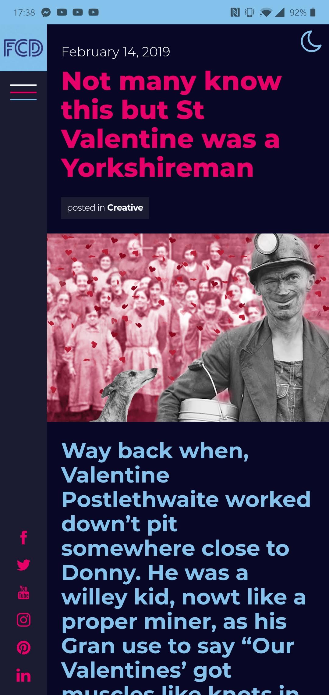
“We’ve been using the light mode for years?! Surely it doesn’t matter?” – whilst it’s not important, a dark mode has its benefits and enhancements over the traditional ‘light mode’. Let’s be honest first, dark modes are fantastic! They’re stylish, dramatic and elegant – Facebook has just introduced their dark mode on the Messenger app and it looks sleek.

The simple answer is it makes your content easier to read. You want to make your website content, especially dynamic content like blog posts, as readable as possible – and having the option for visitors to enable a ‘Dark Mode’ provides a stimulating user experience. It’s elegant too, a majority of the content on the web is on white so why not shake things up a little?
It’s important to give your visitors the option to use ‘light’ or ‘dark’. You should treat a ‘Dark Mode’ as a secondary view option, an accessibility feature more than a core part of your website. But if your branding and logo design benefits from using a dark colour palette then a dark theme as your websites primary style is what you need.


Picture this – you’re curled up on the settee, the lights are low and you are reading your favourite blog content from your favourite design + marketing agency, but nightmare, your eyes are feeling the strain. If the blog was using ‘Dark Mode’ there would be far less chance of eye strain because ‘Dark Mode’ helps reduce this when viewing at night. Supporters of ‘Dark Mode’ claim the benefits of this have been extremely good.
Well, unfortunately, its not a one-click solution. But FCD may be able to help you achieve all the benefits a ‘Dark Mode’ has to offer and look at building one for you – get in touch today and let’s see if you can be turned to the dark side?